Counterpoint Concerts
POSITION:
Marketing & Creative Lead
PROJECT FOCUS:
Logo & Brand Identity, Creative Direction, Marketing Strategy, Website, Social Media, Print, Org & Project Management
CHANNELS:
Paid+Organic Social Media, Email, Event, Video, Web
DATE:
December 2023 – present
COLLABORATORS:
Natalia Kazaryan, Concert Pianist & Founder
Adam Green, Videographer & Marketing Specialist
COUNTERPOINT WEBSITE
COUNTERPOINT INSTAGRAM
Project overview
Counterpoint Concerts is a classical music nonprofit that curates innovative chamber music concerts with diverse programming in the DC metro area. Its goal is to revive the classical music community and reignite interest, especially that of the younger generations, as it is an often overlooked music genre. I collaborated with the founder to create a brand identity that felt current but still classic, as a nod to the genre's roots. The base of the brand is rooted in simplicity, as Counterpoint's main focus is on the music, artists, and community, therefore through color, layout, typography, etc., the brand prioritizes simplicity and negative space. The main brand colors (Natural Ivory, Soft Black, Rich Brass) are sourced from the backbone of the music; e.g., the instruments. Ivory comes from piano keys and sheet music, while Soft Black comes from the details on string instruments, or the makeup of an oboe or traditional grand piano (both the structure and black keys). Lastly, Brass comes from brass instruments, as well as the natural brass tones found in the inner workings of pianos, and other instruments. These three colors work together cohesively, and leave space for any photograph or video to be the eye catching component of any graphic, as intended. Whenever possible, high quality photos and videos that encapsulate the richness of Counterpoint's community and its members' experiences are used.
Brand identity
Outside of branding, my role at Counterpoint is to lead the Marketing and Creative. I designed the logo, with dotted C symbol inspired by historical mensural notation, the musical language that preceded the standard we use today. In mensural notation, a vertically halved circle with a dot in the middle indicated tempus imperfectum maior, which means an imperfected time signature, which was actually the most commonly used time signature during that era because of their style of music! The word imperfection, along with the simplicity of the design felt perfect for Counterpoint, as it seeks to erase the notion that classical music is buttoned up, "perfect," and therefore, unrelateable to the younger generations.


Event branding
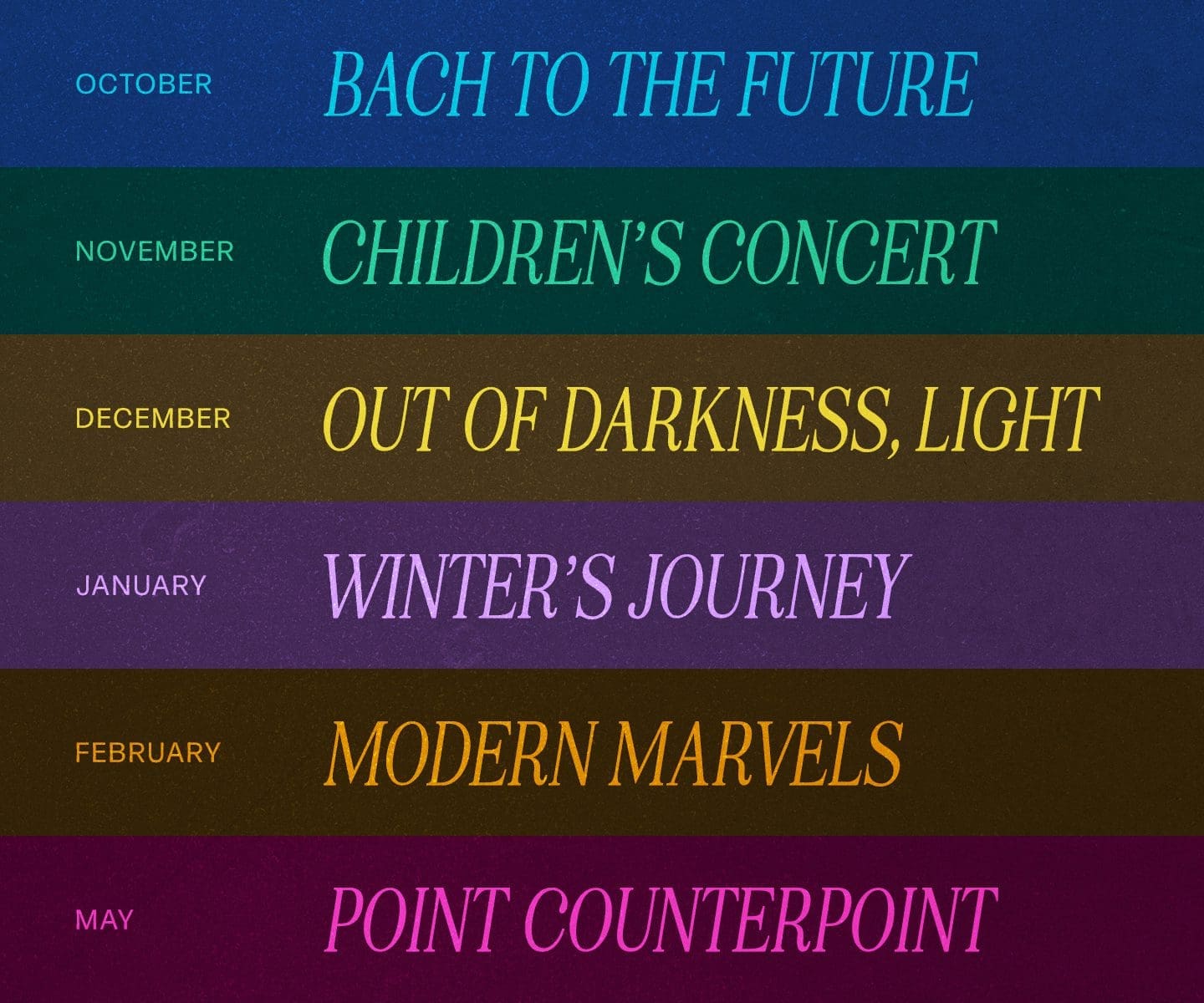
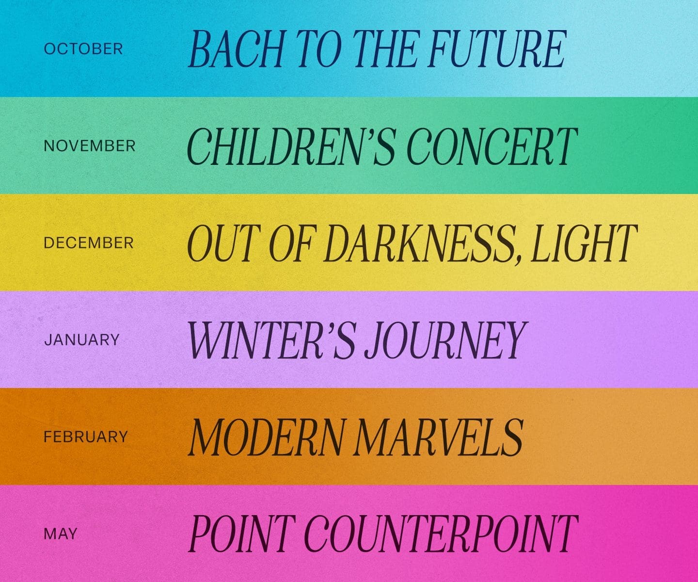
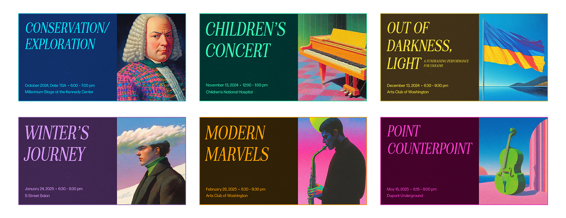
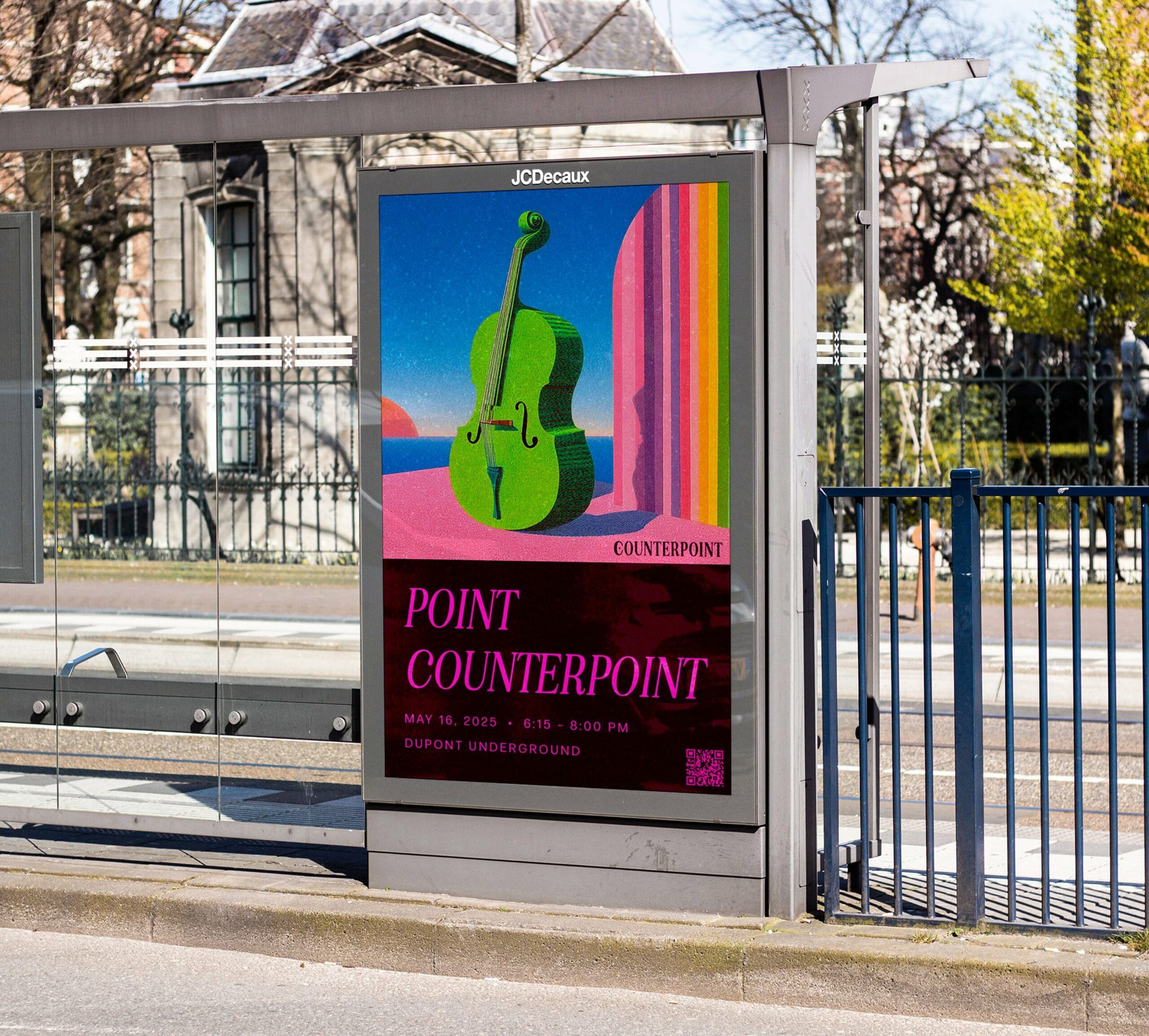
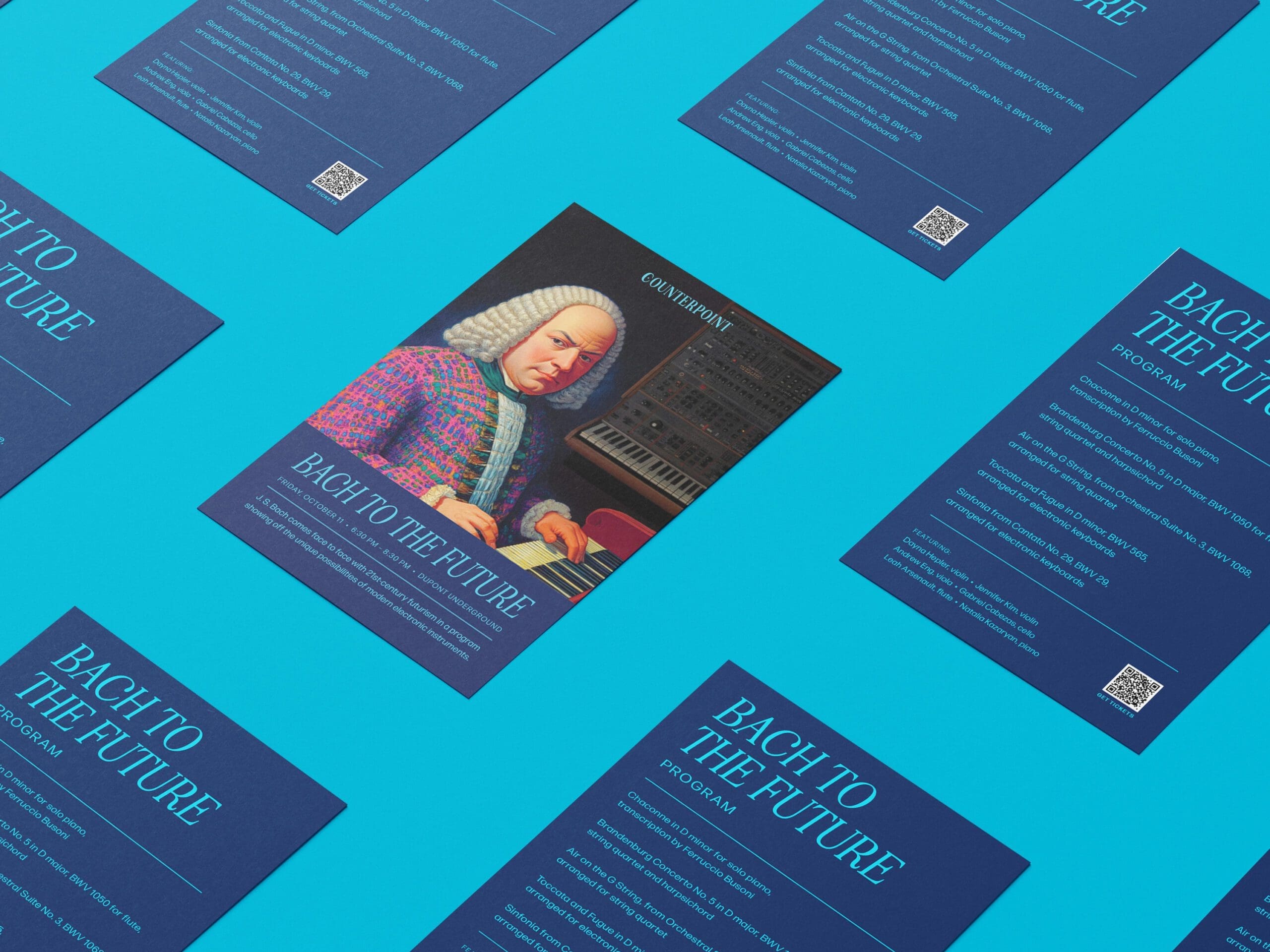
In terms of concert branding, duotone colors have been specified for each event of the season and are only used in the context of that specific show's promotion to maintain the brand’s integrity. The duotone combinations are always two shades of the same color, one being a darker and more traditional shade, representing the traditional and foundational aspect of Counterpoint. The second color is a modern, brighter version which symbolizes the contemporary, innovative side of the organization’s identity. The duotones allow for each event to be easily recognizable, and stand out from general marketing as the events are the most important part of the organization. As well, allowing each event to have its own mini identity highlights the detailed curation and uniqueness of all six events in Season One – each one offering a different, but complementary, experience for the prospective attendee.

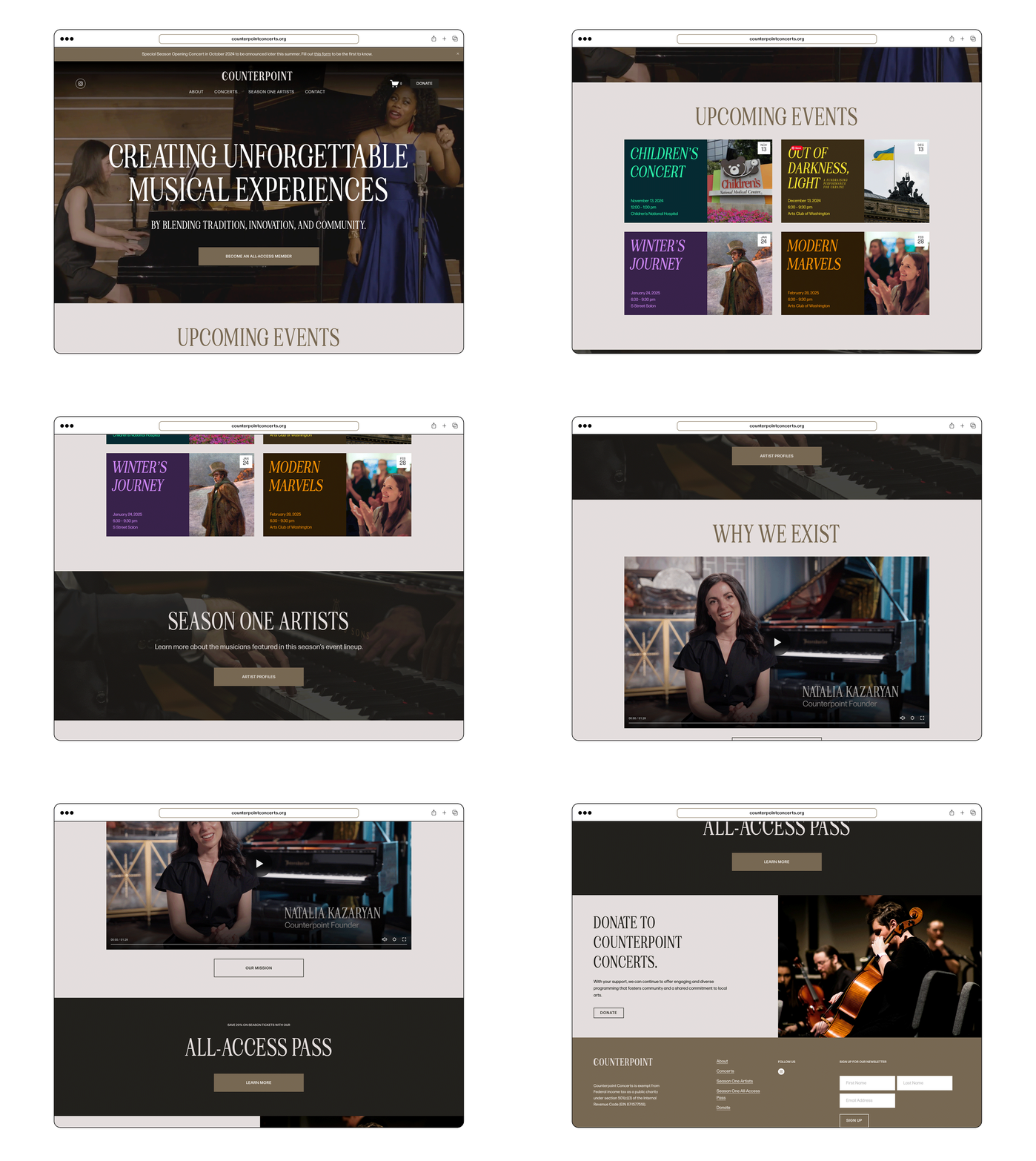
Web design
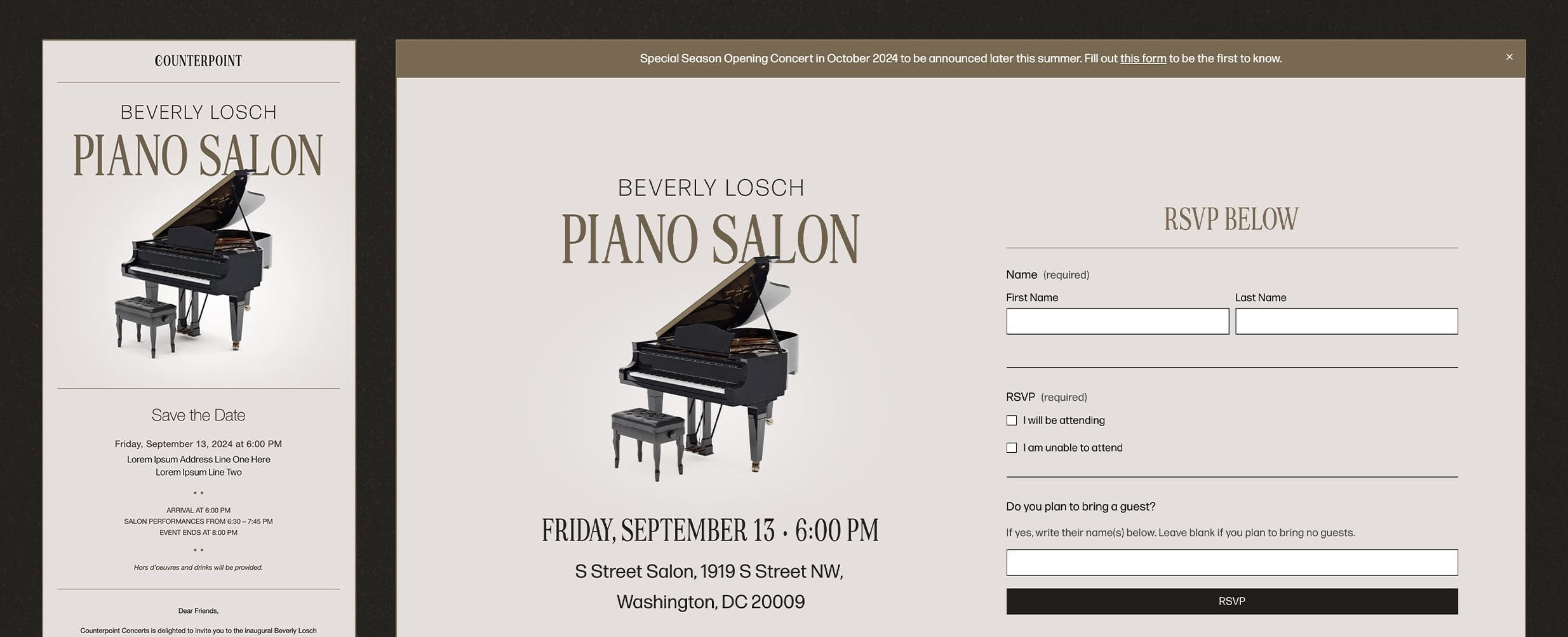
Email and landing page
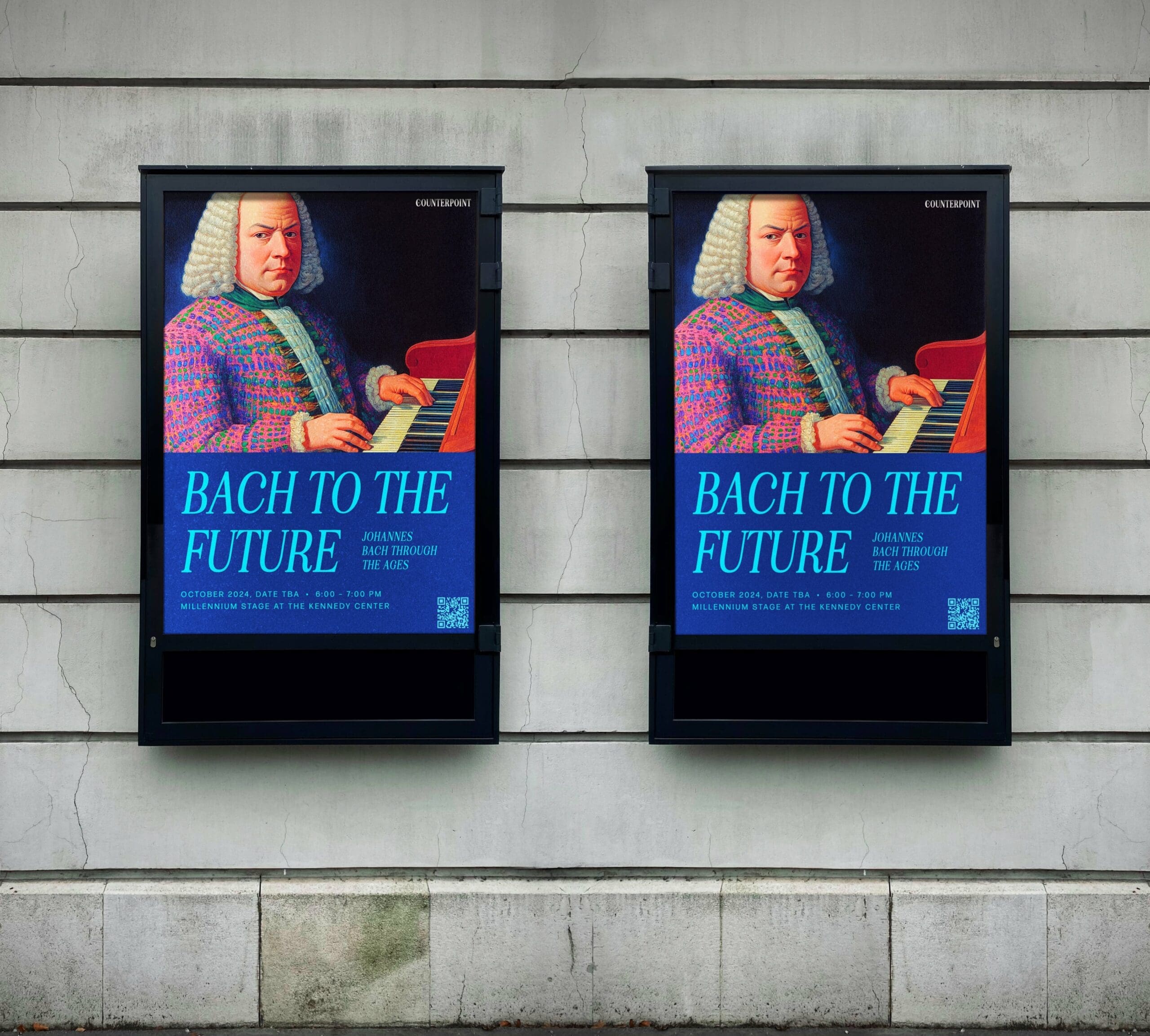
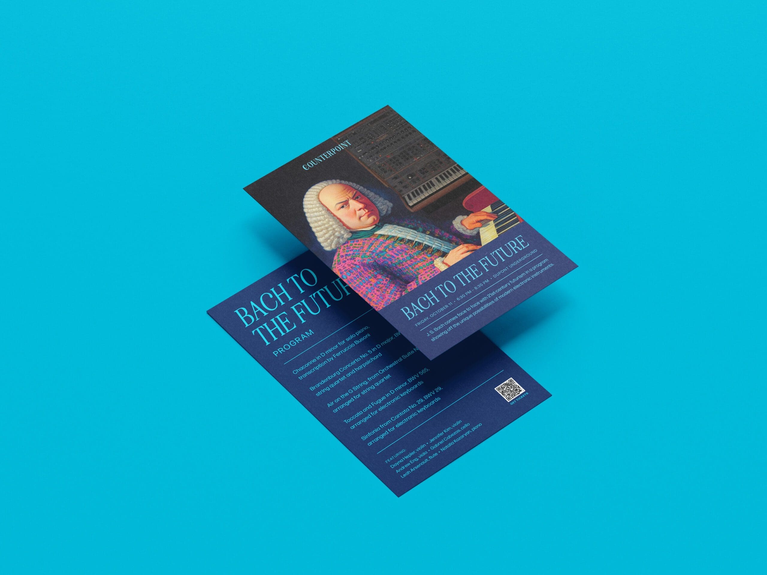
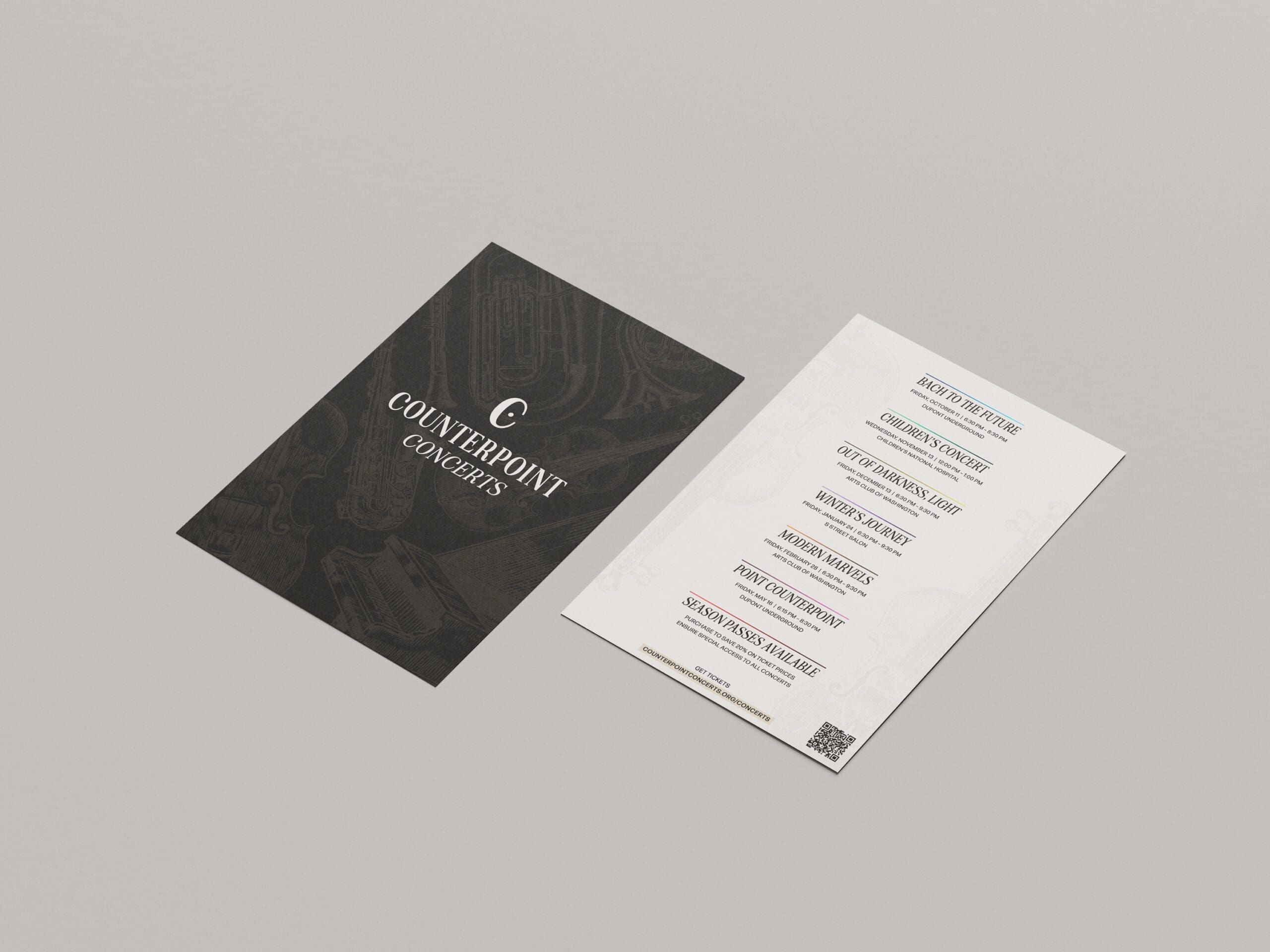
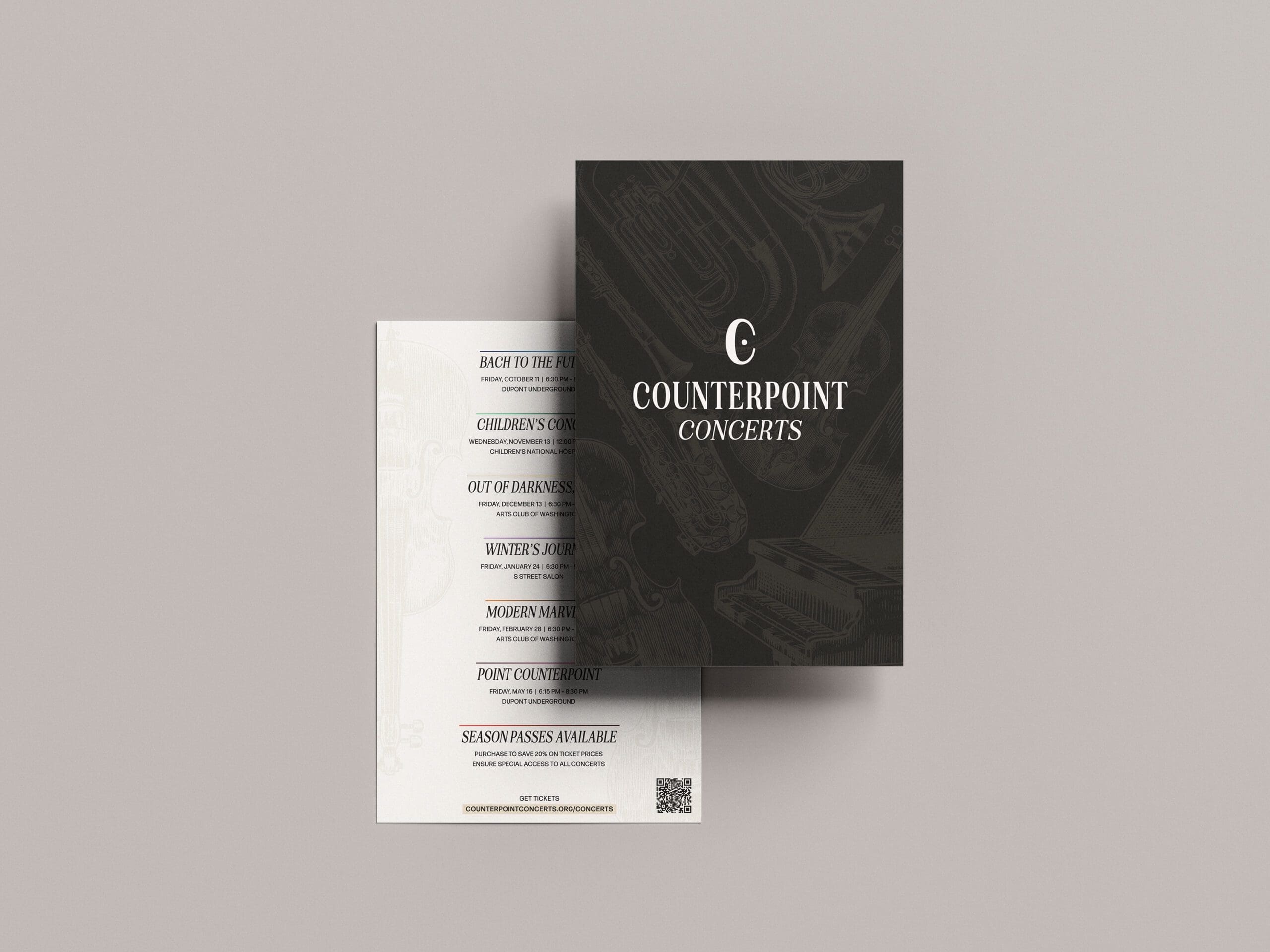
Print flyers for inaugural season event, Bach to the Future, and Season One Schedule
Creative video direction
Social media design
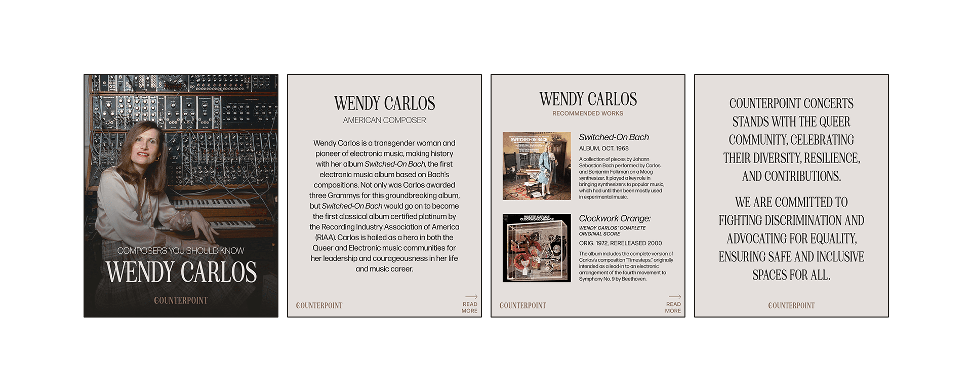
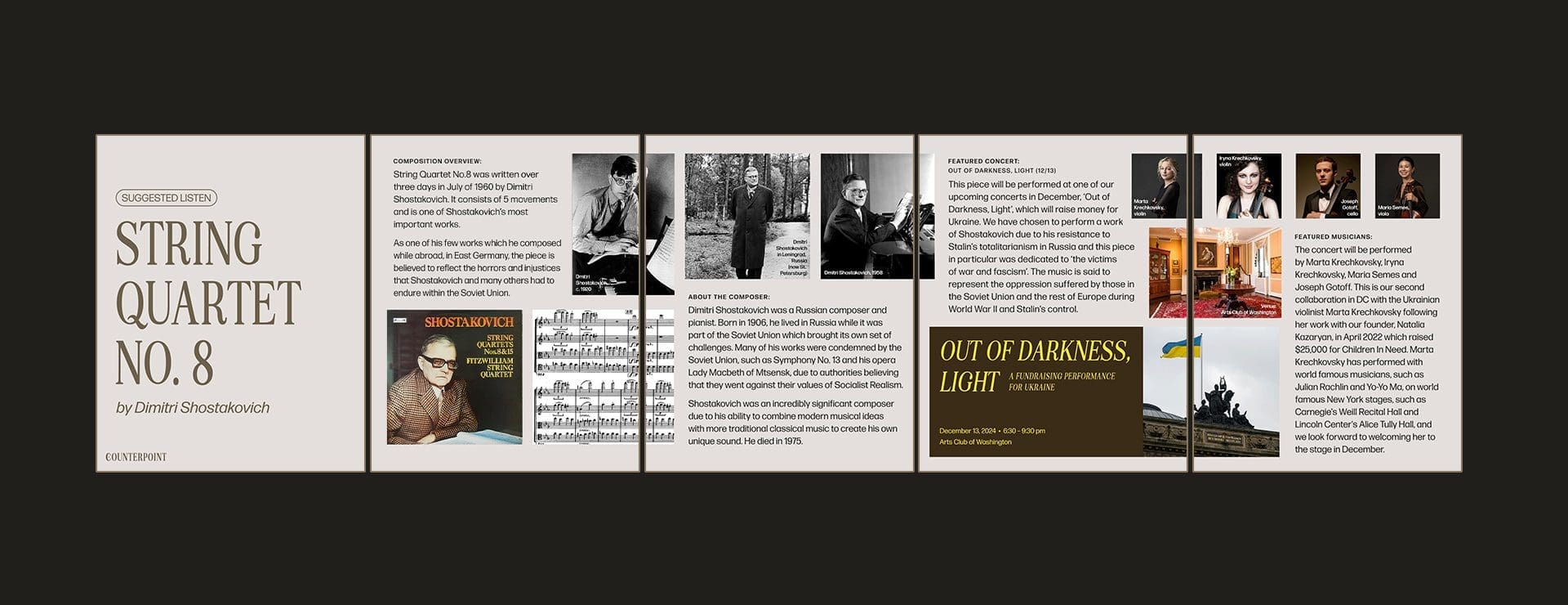
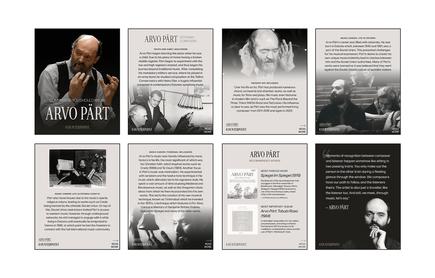
I also design and resize all social media posts / videos, plan the social calendar, along with managing the research and caption writing of my interns for said posts. I also designed, built, and maintain the Counterpoint website, and also craft all newsletter and automated marketing emails. I collaborate with our main videographer and plan shot lists, creatively direct promotional videos and materials, and help on set while filming to make sure we have all necessary content for our marketing needs. My marketing strategy outside of direct event promotion is to create an educational, content-rich, social media presence to appeal to our target user. All of our content is either focused on the musicians we have in Season One (most often performance videos), or posts that provide value and are easily palatable to those interested or curious about classical music (e.g., Suggested Listen posts, Composers You Should Know educational posts, Curated Spotify Playlists, etc.) All of our content is ultimately related to our events and their programming, but is not focused on the sell, but the creation of trust, safety, and interest in the relationship between our followers and our instagram, which ultimately leads to more event ticket sales.
VIEW MORE PROJECTS
Counterpoint ConcertsBrand Design, Creative Direction
CFG Bank ArenaBrand Identity, Creative Direction, Social Media
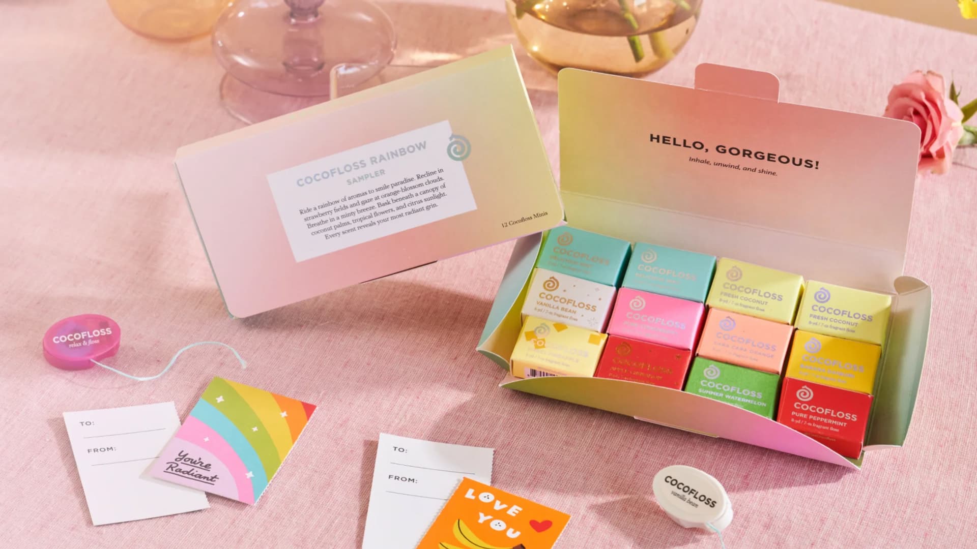
CocoflossMarketing Design
ieró BeautySocial Media, Email, Environmental
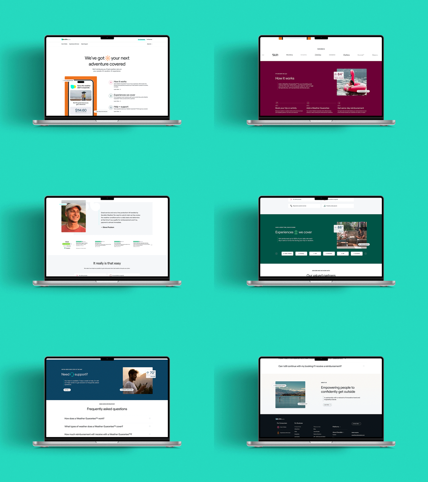
Sensible WeatherCreative Direction, Print Design, Social Design
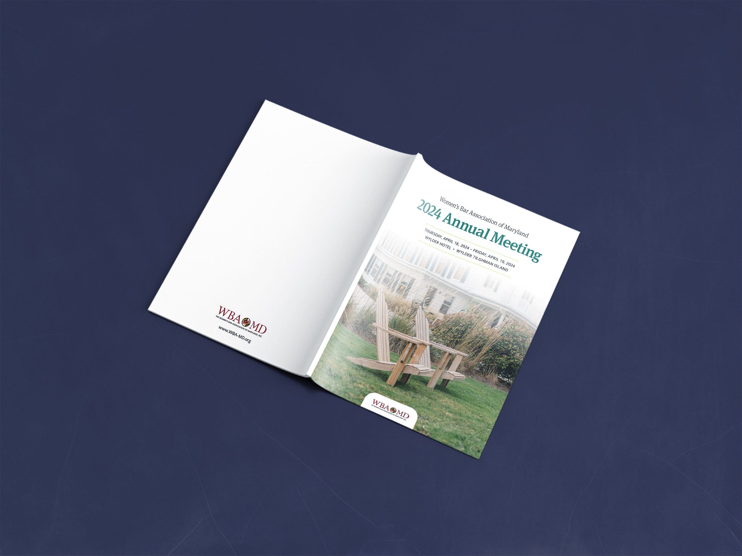
Women's Bar Association of MarylandLayout Design, Print, Creative Direction

Uber Bagels & DeliMerch Design
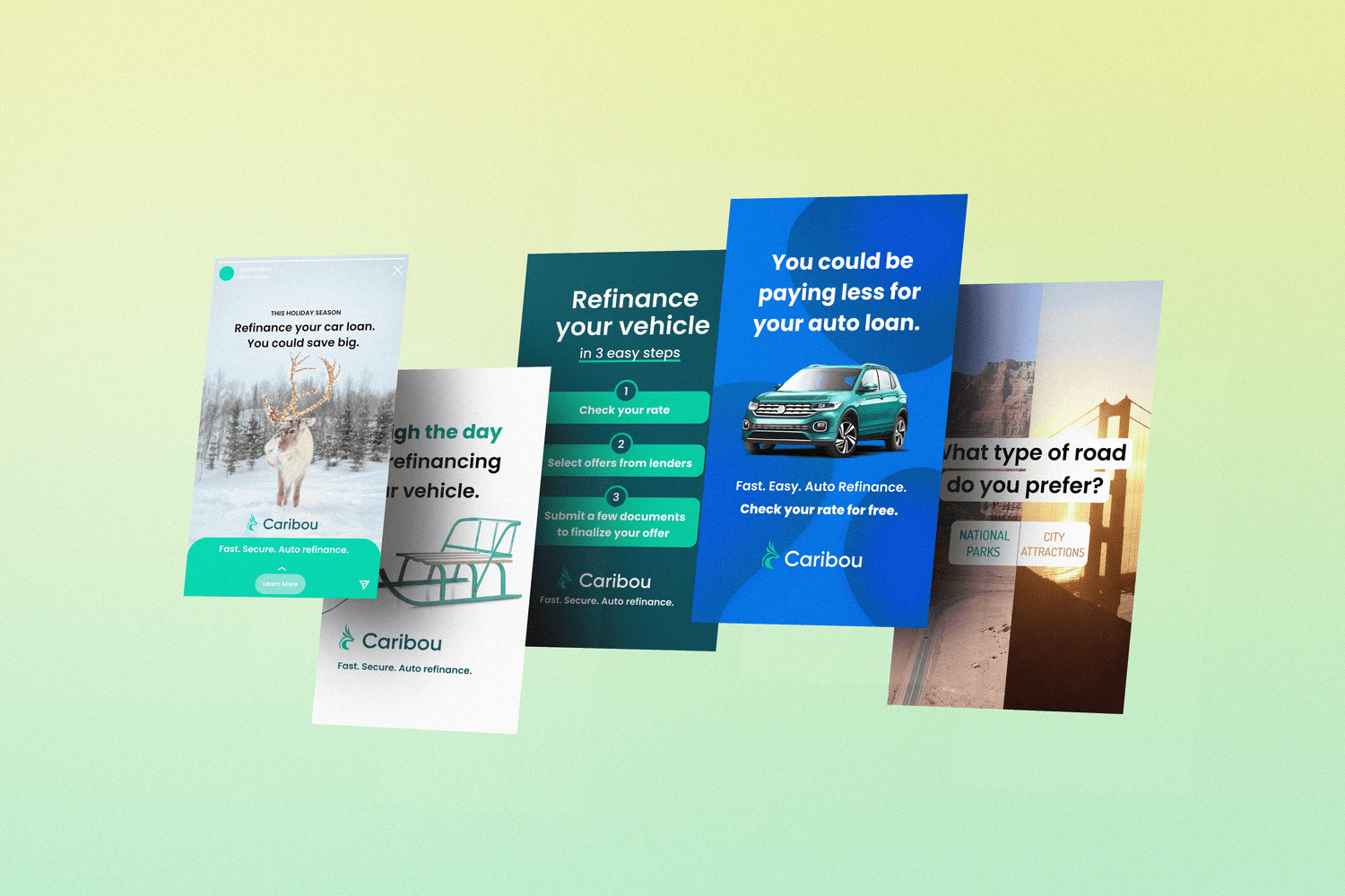
Caribou FinancialPrint Production, Marketing Design
U.S. Green Building CouncilMarketing Design
mclane@odanielldesign.com
© McLane O'Daniell 2024. All Rights Reserved.